
Here's a costly mistake I see brands make repeatedly: shooting beautiful product photography that looks stunning on desktop but tanks mobile conversion rates. The culprit? Aspect ratios that weren't planned for mobile-first viewing.
After analyzing thousands of marketplace listings, I can tell you that image ratio mismatches are silently killing click-through rates, particularly on Amazon and social commerce platforms. Our data shows that poorly optimized product images can reduce mobile conversion rates by up to 40% - a staggering number that most brands aren't even aware of.
The Mobile Reality Check
Let's get real: 72% of ecommerce happens on mobile now. Yet many brands still shoot ecommerce product images in legacy 4:3 or 1:1 ratios, perfect for desktop but problematic on phones. Mobile users see these images either too small (with wasted white space) or awkwardly cropped, creating a subpar shopping experience that directly impacts purchasing decisions.
The impact? Lower engagement, reduced click-through rates, and ultimately, lost sales. I've seen conversion drops of 15-30% when product images aren't optimized for mobile viewing. In one case study, a fashion retailer saw their mobile conversion rate jump by 23% simply by reformatting their product images to mobile-optimized ratios.
Platform-Specific Ratio Requirements
Each major marketplace and social platform has specific image ratio requirements, and understanding these is crucial for cross-platform success:
- Amazon: 1:1 square main images (but 4:3 or 16:9 for lifestyle shots)
- Instagram Feed: 1:1 square, 4:5 vertical
- Instagram Stories/Reels: 9:16 vertical
- Facebook Shop: 1:1 square preferred
- TikTok Shop: 9:16 vertical
- Pinterest: 2:3 vertical preferred
- Shopify: Flexible, but 1:1 recommended
- Google Shopping: 1:1 square minimum
The trick isn't just meeting these requirements, it's planning your packshot composition to work across all of them while maintaining product appeal and detail visibility.
Mobile-First Composition Strategies
Smart brands are adapting their product photography workflow with these proven strategies:
1. Shoot Wide, Crop Tight: Capture wider shots that can be cropped to multiple ratios without losing critical product details. This means shooting with a minimum 30% padding around your subject.
2. Center-Weighted Composition: Keep key product features centered for flexible cropping. This ensures your product remains the focal point across all formats.
3. Vertical Priority: When shooting ugc style content, default to vertical framing, which converts better for instagram ad creative and most social commerce.
4. Dynamic Space Planning: Consider how your product will appear in different crops and plan negative space accordingly.
5. Multi-Format Testing: Create variations of each shot optimized for different platforms' requirements.
The AI Advantage
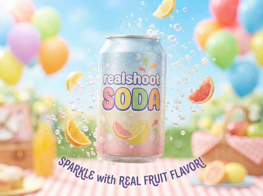
Modern AI photo generation tools are revolutionizing ratio optimization. Instead of expensive reshoots, brands can now generate multiple aspect ratios from a single product shot, maintaining consistent lighting and composition across all formats. This technology isn't just about convenience - it's about maintaining brand consistency while optimizing for platform-specific requirements.
AI tools can now:
- Automatically extend backgrounds for different ratios
- Maintain product proportions while adjusting composition
- Generate platform-specific variants in bulk
- Preserve critical product details across formats
Testing and Optimization
The real magic happens when you start testing different ratios:
- A/B test vertical vs square formats for your main listing images
- Monitor mobile vs desktop conversion rates separately
- Track aspect ratio performance across different product categories
- Consider seasonal variations (holiday shopping is heavily mobile)
- Analyze user behavior patterns across devices
- Test different crops for the same product
Implementation Checklist
Ready to fix your ratio issues? Start here:
- Audit your current product images across devices
- Identify high-traffic listings with poor mobile presentation
- Prioritize updates for your best-selling items
- Create a shot list for new ratio-optimized photos
- Set up tracking to measure the impact
- Implement A/B testing protocols
- Establish a mobile-first photography workflow
- Train your team on new shooting guidelines
Remember, mobile optimization isn't just about ratios, it's about the entire visual experience. Clean backgrounds, sharp details, and fast loading times all matter. But get the ratio wrong, and nothing else matters, because your customers won't even click through to see more.
The brands seeing the best results are those treating mobile ratios as a strategic priority, not an afterthought. In today's mobile-first world, that's the difference between thriving and merely surviving in the increasingly competitive ecommerce landscape. The data is clear: mobile-optimized product photography isn't just a nice-to-have - it's a fundamental requirement for ecommerce success in 2024 and beyond.